Visualisations = Clarity
If your pitch deck, sales PDF, or training document has all the required information but feels a little unclear, consider visualisations. A good visualisation can make the complex clear and will give your presentation the boost it needs.
“Most of us need to listen to the music to understand how beautiful it is. But often that’s how we present statistics: we just show the notes, we don’t play the music.”
– Hans Rosling, Physician and data visualisation expert
How do visualisations work?
Visualisations work by translating numbers and information into a visual format that makes it easier for our brains to understand.
Our brains are wired to process visual information very efficiently. Visuals can convey a lot of information at once, using shapes, colours, and spatial relationships to encode complex ideas.
Charts, graphs, and maps can reveal patterns, trends, and relationships that might be difficult to see with just raw numbers. Spreadsheets are ideal for detail, but visualisations are better at conveying the ‘big picture’.
How do visualisations help?
Visualisations can:
1. Reveal patterns and trends potentially hidden in raw data
2. Make complex data understandable
Grasp the big picture and identify important insights.
3. Improve communication and decision-making
Presenting data in a clear and concise way helps people from different backgrounds understand information. This fosters better communication and collaboration and so promotes more informed decisions.
4. Encourage fun and interaction with your presentations and materials!
Visualisation Examples
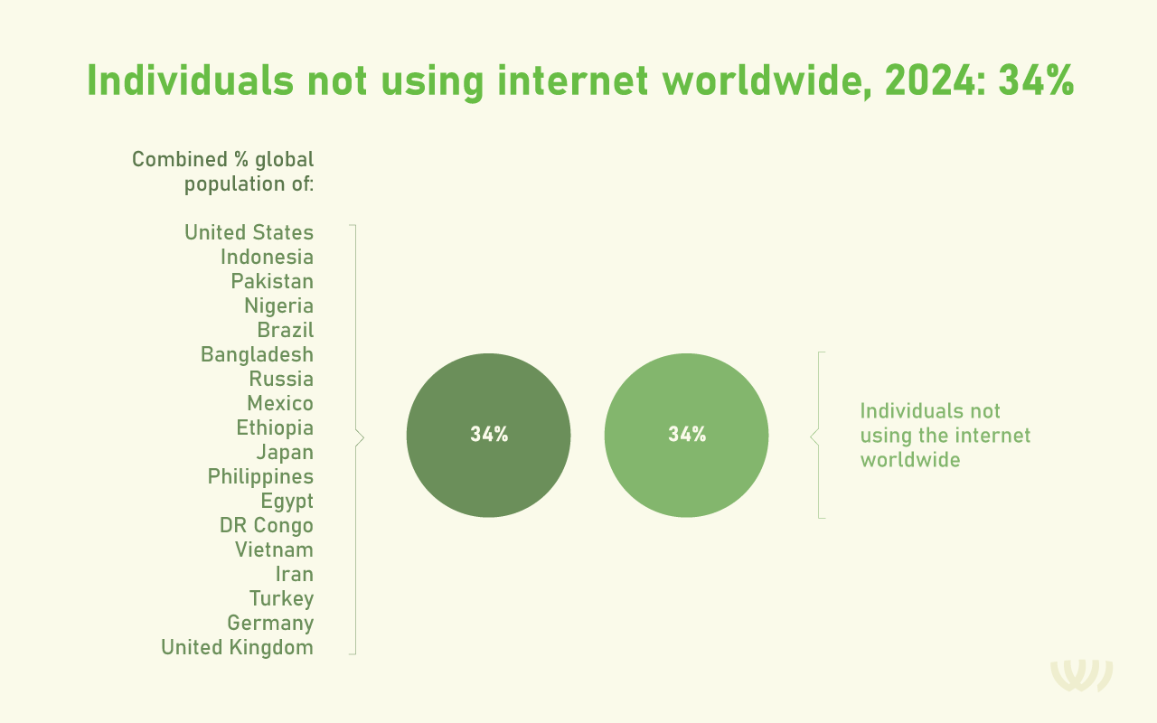
Example 1, A visual sense of scale supports a % figure
Data source: Simon Kemp (2024) – “Internet use in 2024” Published online at https://datareportal.com. Retrieved from: ‘https://datareportal.com/reports/digital-2024-deep-dive-the-state-of-internet-adoption’ [Online Resource]
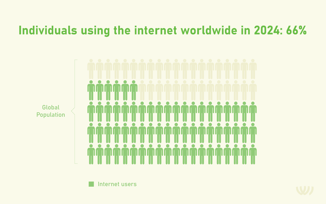
Example 2, Shapes make for easy comparison
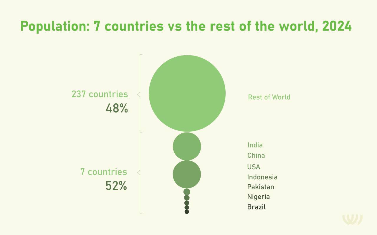
Data source: Hannah Ritchie, Edouard Mathieu, Max Roser and Esteban Ortiz-Ospina (2023) – “Internet” Published online at OurWorldInData.org. Retrieved from: ‘https://ourworldindata.org/internet’ [Online Resource]
Example 3, Labels and shapes deliver a message