
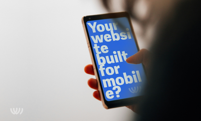
Featured Image: 20 people visit your site? About 11 of them used their mobile.
In 2023 it’s obvious that you need to consider phone users before designing your website. You’ll need to continue catering to desktop users, but it has become essential that websites accommodate small, medium, and large screen formats.
55% of website traffic = mobile devices
According to some sources, more than half of all website traffic comes from people using mobile devices. Although most statistics are derived from samples, you only need to look around you to see they can’t be far off.
Responsive design for various screens sizes
The simplest way to accommodate all the various screen sizes is to build a responsive website. This is a well-established method where variations of page layouts are developed for small, medium, or large screen sizes. When a page loads, the screen size is detected, and the appropriate layout is delivered.
Mobile > Desktop
All the above is straightforward. The important bit is that in the last 3 years, the small screen has come to dominate. So, when building your site, it may be wise to consider a mobile-first approach. Aside from benefitting your site on the mobile experience, the restricted space of a small screen layout will also help you focus on the essential components and content that should make up your website.


