
Update: 20 June 2025
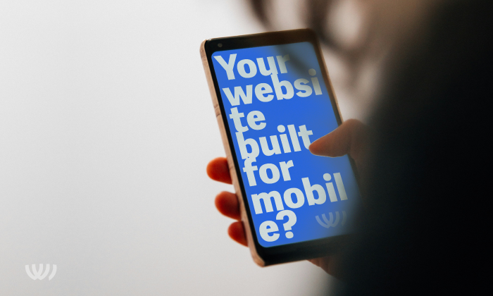
In short, there’s now a 63% chance you’re reading this on your mobile right now…
50% chance you’re on your mobile right now…
In the UK, we’re using our mobile devices for roughly half of our web browsing (2024). This trend that has been on a steady incline for over a decade means your website likely be viewed the most on mobile.
The future of desktops
While desktop computers will still have their place for certain tasks, their overall usage for web browsing is likely to decline. This is especially true for younger demographics who have grown up with mobile devices.
The desktop has some benefits over the mobile. Ergonomics, large screens, business applications, creative applications, and gaming are a few areas that come to mind.
While the desktop’s role in web browsing may diminish, it is likely to remain a valuable tool for specific use cases and continue to evolve to meet changing needs.
We’ll take a punt and suggest that the future may involve a situation where our devices are perfectly integrated and are in essence the same machine accessed through different means.
The future of mobiles
While desktop usage declines, emerging technologies like 5G and foldable screens may accelerate the dominance of our mobile devices to a point where many users may never use a desktop. Even if users reject foldable screens, mobile performance will continue to improve.
It’s difficult to imagine a situation where mobile devices lose their dominance.
Build websites for mobile and desktop
In 2024 it makes sense to give equal attention to designing a website for mobile and desktop.
Consider the following when building your website for mobile and desktop.
Mobile website design tips:
Build for change
Building a responsive website that caters to the mobile experience will allow you to:
- Create something that looks beautiful on all devices
- Develop logic that will provide a seamless and enjoyable user experience
- Be prepared for ongoing change as new devices are developed
Hope you found this article helpful.

